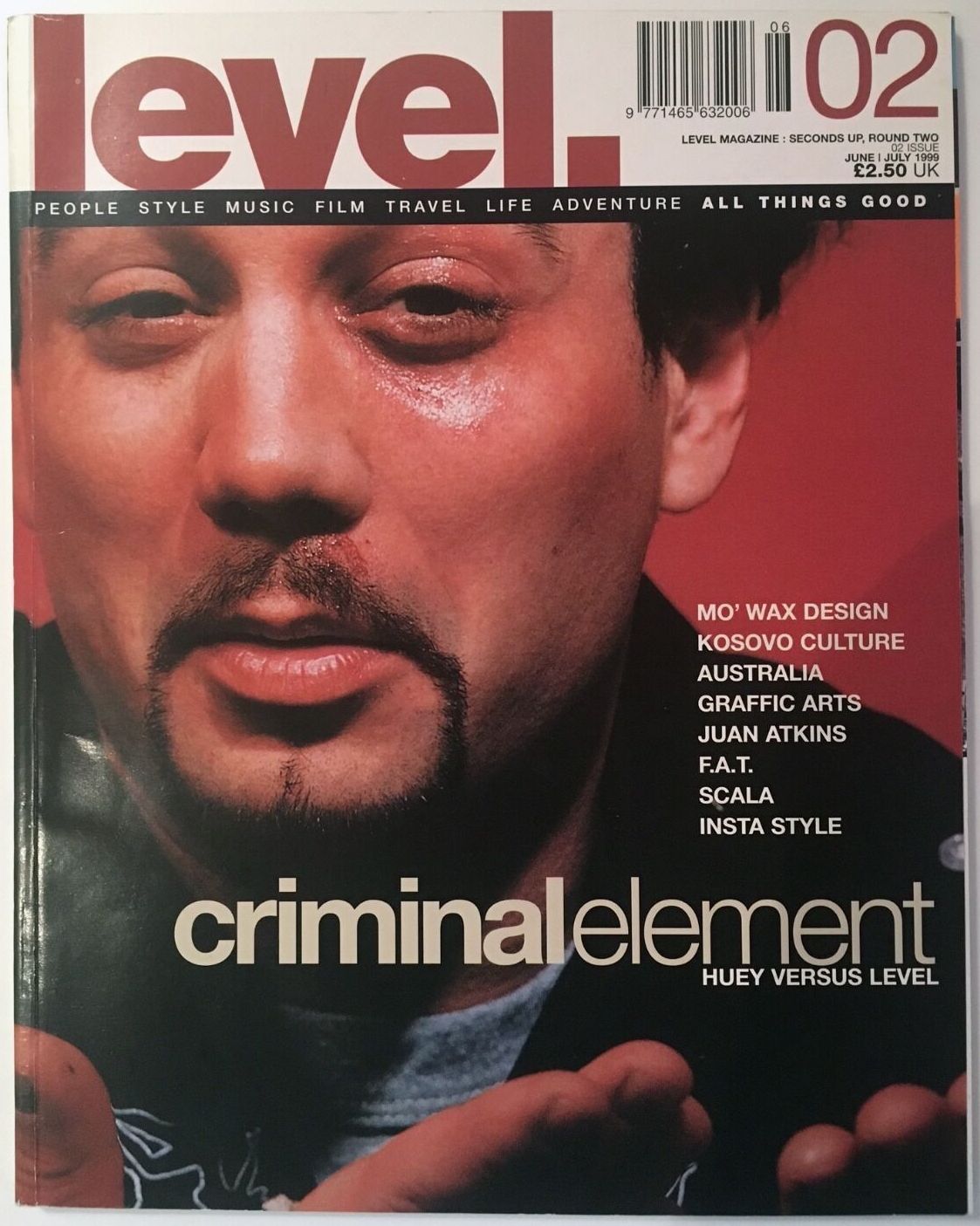
Level Magazine June July 1999
 Issue 2. June / July 1999 | |
| Country | England |
|---|---|
| Language | English |
The second issue of Level Magazine features an article about Mo’ Wax designer Ben Drury.
Transcript
BEN DRURY – MO’ WAX SECRET GRAPHICAL WEAPON
Let’s say you’ve completed University with a degree in fine or graphic art. Or maybe your personal work has reached the point where you feel ready to face the nation with your new interpretation of whatever. How are you going to reach the world and scoop the Rothschild commission? It seems to me that while you may well produce the most original and innovative work, the chances of it ever being discovered and appreciated by anyone of note can often appear very limited. 10% inspiration and 90% perspiration seems to be the industry standard for success in any arts related field. What media would you use to get your work out there? Organise a gallery exhibition or happening with a few friends maybe, imaginatively display your finest pieces in the hope someone sober enough will attend, notice your craft and act upon their gut feeling? How about the Internet where you could have worldwide audience eagerly downloading your artwork as screen savers? Not a bad idea, but getting paid could present a few problems. How about spending that £40,000 left from your affluent life as a student and print your own book. Nah. Graffiti works, and with a potential audience of millions it will improve a painter’s notoriety if not their payroll.
There are more outlets for photographers who can join the competitive market of magazine and newspaper image gathering, though as we know newspapers merely become chip wrappers and most magazines become nothing more than shelf clutter My point is this: how can you encourage the work you love producing to touch the lives of the general public, and ensure it won’t be forgotten, discarded or simply left to gather dust? My motivation to write this article was inspired by all the hype surrounding the launch of last year’s UNKLE album. James Lavelle and DJ Shadow’s collaborative project was finally released, and as a package of tracks, artists and production, on the whole it seemed pretty impressive, even if the sales figures didn’t exactly match the initial enthusiasm. However, forever on a different tip (having realised I’m beginning to sound a little NME there) Level magazine’s curiosity was somewhat irked by the lack of press coverage for the actual appearance of the album itself. Whilst we were aware of the involvement of Futura 2000, possibly the longest standing graf writer of them all (?) the name of the designer i.e. the person who put the designs of Futura (or Fu as he will be referred to) and the stunning photography of Will Bankhead plus all the important information essential for any record sleeve (track listing, artists and thankyou’s etc.) was done by an ill-credited Ben Drury. Who? We tracked down the Mo’ Wax design supremo to a salubrious alley in a part of town known as Parsons Green.
My first and most obvious question relates to the sleeve of that LP “The whole thing about the album was that it was such a melting pot and I was the person who had to interpret and represent it. As far as not being credited with the design, Fu did the cover image and characters, which was always how it was going to be.” I can totally accept that I didn’t get the credit for that. I was credited for the overall design of the project but it just happens that it is not necessarily the initial impact – the one people tend to respond to. I’m not bitter about it at all, it’s all part of the reality of being a commercial artist. It was James’ own project and as MID and head of A&R he made a point of being involved at every stage. Therefore the sleeve wasn’t exactly the one that I would have done, if it had been my personal vision that I had worked out and seen through to the end I would have been pissed off. As it is, it’s a good sleeve with an awful lot of stuff in it, the photos are wicked, the whole image is cool, and I got paid. The worst thing was that I was just out of hospital.” (He later shows me the dent in his bikes crossbar caused by hitting a car.) This had a pretty major effect on him and his employers due to loads of Mo’ Wax releases being delayed whilst awaiting sleeves. I had to endure this mad pressure of having three days to complete the thing because it was being printed in Japan, International couriers, blah, blah. A hard slog but you know, I got it done and it was all cool.”
One of the worst elements, after getting paid to be creative, is factor Z – the deadline. Many of the best laid plans have been foiled due to there not being enough time to achieve your mental vision. Just how often does work go out that’s rushed and not satisfactory? “Occasionally. I mean, every job feels like it’s rushed even though things can be around for a long time. It’s pretty standard that there’s a rush on at the end, whether that’s down to other things taking up too much time or somebody changing their mind and deciding that the design’s ‘not okay’ right at the last minute when it’s been approved for a while. All my deadlines seem pretty tight and there have been a few times when I’ve been disappointed with what’s gone out, but on the whole I try not to let it happen because it reflects badly on me.” I’d love to see Ben in a rush. Through the course of the interview and the phone calls that surround it, I can only presume his phenomenally chilled nature stems from his formative years spent in rural Cornwall. They’re all cool from there you know.
Going back, how did this opportunity arise? I was still at college (Central St. Marlins) with Will Bankhead (sometime collaborator), who had been asked to take a photo of James (Lavelle, in case you didn’t realise) for Phat magazine. They got on well, and Will ended up doing some photography for James. It was through this connection that I met James who asked me to do some logo work for him. At that time Swifty (now with Straight no Chaser magazine) was doing Mo’ Wax sleeves and James didn’t seem happy with what he was doing there. There came a point when James told Will & I we could do the sleeves, from then on, between us we’ve been responsible for all the Mo’ Wax artwork. I didn’t come into it with no experience. I’d been doing other record sleeves for artists like Global Communication and various Techno labels. My first Mo’ Wax sleeve proper was What Does Your Soul Look Like? (limited release CID format) by DJ Shadow. There were a few mistakes on it – I put the bar code on the inside of the gatefold so they had to stick a label on the outer bag too!” Judging by his laughter, Ben didn’t have to pay for this error, putting it down to experience. Together with Will Bankhead’s photographs, Ben went on to produce some famous artworks for the likes of Sam Sever, Money Mark and designwise set the label up as a style leader, certainly when compared to some of the, let’s say poorer, labels.
For the technical boffins amongst us, here’s some technical information: I use Quark 4. I do lots of things that you’re not supposed to do with it. I use Freehand 7 but not Illustrator, which I don’t like. Photoshop 4 for bits of retouching, but mainly for logos and colouring images. I don’t use filters, well maybe occasionally, but on the whole they’re crap. My computers are Power Mac 8200/250, and 8600, which aren’t really good enough and I break them constantly. I think I’m doing something wrong as they fuck up on a regular basis. Everyone said run Norton Utilities which I did and now it’s worse than ever. It crashes all the time. I have to turn it off at the green light button At this point, Ben cracks up in that eccentric British way of his, implying to me that all this plastic box is to him is a way of communicating his art, for which he has an unmistakable talent. He kicks a knackered Mac under his desk which looks like it should easily fetch £2k, telling me of another machine that met its demise at the hands of his frenetic mouse play, I’ve got two more at home in a similar state. The scanner (Agfa Arcus) was good once. It does the job, although all our high resolution work comes from our repro house that always sorts us out.”
Though it would never occur, what if the repo man reclaimed all of this knackered Mac equipment leaving you free of computer aided design but the records still needed bags? It would be difficult at first, but I could definitely do it and although the sleeves would be different they wouldn’t be worse. My logo work always starts off drawn by hand, and then there comes a point when it has to be put into a computer to take a different angle, though it’s often the initial drawn version that I’m happiest with. James has always liked the textural quality associated with graffiti, and early Mo’ Wax sleeves were hand done in a scribbly style which I inherited from Swifty, though I was really into cleaner, tighter design. You have to remember that you need to cater the artwork to the individual style of the artist whose record it is, whilst also linking in the label’s identity. It can be difficult designing a sleeve for a particular artist whose music doesn’t really inspire you, but as a commercial artist you have to do your best with every brief you’re given. Sometimes it’s a non-stop battle with artists to get your ideas through and for them to have a little faith, as they are often stony set with an idea that you know will look so shit. You really want to say to them, ‘look, trust me. I can do something far better and you will love far more than anything you can do’, which of course you never actually do say, sadly. The sleeves I’m always least happy with are the ones where someone has come to me with a idea that I’ve had to interpret directly, making a terrible idea presentable. That said, I’m very happy with a vast amount of the work that I’ve done. James knows that I can interpret his ideas into exactly what he wants, and he’s the only person I can work with on that (sometimes intense) level.”
Often, when meeting people who’s work I admire, I’ve met disappointment at the blase attitude of casual disregard towards work others would die to do (see the Cardigans, Level 01). There’s nothing I hate more, in fact, Not once during my afternoon with Ben Drury did I detect the slightest hint of anything approaching this pet hate of mine. He tackles every job with the intention of it being his best cover yet, and maybe that’s why he’s at the top of his tree design wise (other than the occasional bout of excusable slackness – hey, we all do it). Though from a journo’s point of view it can often be difficult to drag enthusiasm from people who do their jobs day in, day out, Ben had a wealth of experiences to call on when I asked him about his career highlights. “A good period was when we were the first people to be getting away with a lot of things which until then were unheard of. For example, printing on the inside of sleeves which everyone was doing after they’d seen ours. There’s definitely a tangible air of excitement when things come back from the printers. There are high points like converting 2-D drawings of Money Mark into 3-D prototype toys. The best times are when you get things through that you’ve really fought for and it comes back and it proves that it was totally the right thing to do. That’s wicked though not really the ultimate rush.” Which is what for christ’s sake? I think the book (a Futura 2000 retrospective, due to be released Spring 2000) which at 176 pages is a bit of a leap from a booklet in a 12″ sleeve, which is the only comparable thing I’ve done. In terms of scale it’s an awesome project, though the cash to work scale is a little unbalanced, it’s definitly a labour of love. My ambition is what it should be, to become internationally renowned and respected as a great graphic art ist. You know, for producing consistently high quality work. That recognition would bring happiness. I know that commercially there’s a lot more that I could do to achieve that, but self promotion isn’t really my forte.”
I find it amazing that anyone could oven find their computer (stil in an office like Ben’s. Loads of Japanese toys I packaged, obviously) battle against piles of artwork and old sleeves for attention whilst the ashtray becomes the busiest area of the room. Nothing like the smoked glass and chrome technocentre I imagined. The Mo’Wax design centre is a pokey, untidy mound of clutter in an almost windowless building in South West London where Van Gogh would have remained uninspired.
Rounding up I asked Ben to consider just how much of his work people actually own. It’s not really my work they’re buying. It’s sometimes difficult to connect with that as it’s only when I see it in a record store or when someone tells me they like it do I then realise its true worth.” Ben modestly claims that people don’t buy his artwork, they buy the record, but I disagree entirely. I can’t think how many times my judgement has been swayed by an average record in a fantastic sleeve.
The most humourous event of the afternoon comes when we attempt to put a roundabout figure on the amount of sleeves in existence which are adorned with Ben’s artwork. He mumbles numbers like 74 and 17, configuring a crazy sum on the Mac’s calculator. The number is that of the devil, 666,000. A (very) rough but scary approximation of the amount of Ben Drury’s work that people are enjoying.
Scans
-
Cover